


Visualization and Communication
Civic Insight helps partners turn complex analysis into clear stories that inform action.
Overview
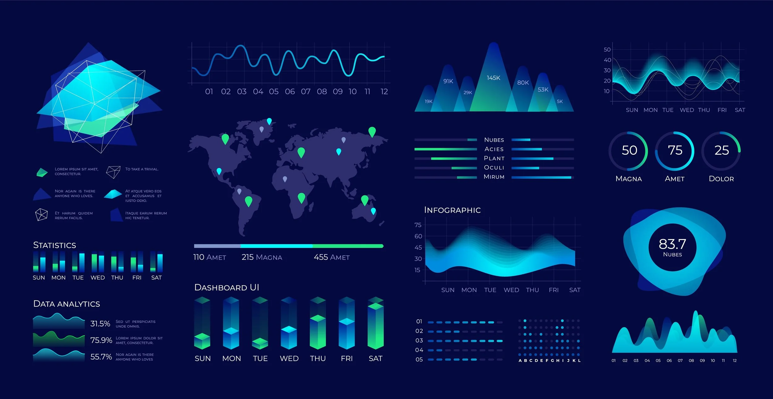
We build interactive dashboards, maps, and visual reports that make it easy for diverse audiences to understand key findings and explore data on their own. Our communication support extends from board presentations and briefs to public-facing tools that help communities engage with information that affects them.
Example Focus Areas
-
Designing dashboards tailored to staff, leadership, and funder needs
-
Creating accessible visuals for reports, presentations, and websites
-
Developing public-facing tools that promote transparency and engagement
Bite-Sized FAQ
-
Even strong analysis can fall flat if it is hard to interpret or share. Visualization and Communication services help partners move beyond dense tables and technical language, making insights clear to decision-makers and community stakeholders alike.
-
Any organization that wants to communicate data more effectively—whether to boards, residents, funders, or policymakers—can benefit from this service. It is especially helpful for partners managing complex initiatives or multi-site efforts.
-
Presenting data visually can lead to more productive meetings, clearer conversations about trade-offs, and greater engagement from stakeholders. Visual tools also make it easier to track progress over time and quickly refresh materials as new data becomes available.
-
Yes. We work with a range of platforms and will recommend solutions that fit your technical environment and internal capacity, whether that means integrating with existing systems or designing stand-alone tools.
Still Intrigued?
We hope so. Learn about our other Services.